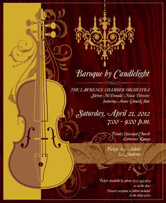
Baroque by Candlelight…Ft.Myers Photographer

Here we are again with a new poster design from Jessica’s Sprague Poster Class. I enjoyed this lesson because where I live the arts is a BIG deal! I can see myself designing something like this in my home town someday. How fun!
Design Techniques We Learned:
- “Hang” a large graphic element along one edge of the poster
- Ensure that type is strictly aligned – left or right
- Give type breathing room – both at the ends of lines and in between lines – Larger type needs more breathing room
- Create a triangle of design elements to frame important information
- “Blocks” of color at the top or bottom, left or right of the poster add depth and give the eye somewhere to start looking
The poster is a 18×22 and dry-mounted so it can be hung on the walls of the community college buildings, and other places around town.
Do you have an event in your community that you would like me to design a poster for? Please comment in the space below. What is your take on the Baroque look on this poster? I would love to hear your comments.


Pingback: DIY…Diamond Pattern Wall With Thumbtack Border « Pride in Photos